
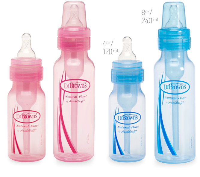
Dr. Browns Natural Flow Baby Bottles
Colic can be a nightmare for some parents, this is why Handi Craft invented their patented designed Dr. Brown’s baby bottles. These bottles have a vent and a straw that prevents the creation of air bubbles. The potential air is vented through the hole in the side of the vent, and pushed through the straw away from the baby’s mouth. This vent also prevents the nipple of the bottle from suctioning together which, gives the liquid a constant natural flow, as if the baby were being breastfed.
I first heard of this product when my cousin had her child, about a year before my baby was born. I was actually told by another cousin, to let her know that if she is experiencing colic with her baby to try Dr. Brown’s baby bottles. Both of my cousins work in the medical field, and I therefore kept the Dr. Browns name in the back of my head for future reference.
I didn’t really do any research on bottles before buying the full set of Dr. Brown’s bottles, I just went with the word of mouth suggestion. These bottles are quite expensive (approximately ten dollars for an eight ounce bottle) so I decided to wait until they went on sale to purchase a set. The purchased set included; four, four ounce bottles, two, eight ounce bottles, one, two ounce bottle, a bottle warmer, soother holder and two orthodontic soother’s for $70 taxes included.
When my little Dionne was born, I opened the box and prepared the bottles for formula. I received a few other sets of bottles at my baby shower, I opened those as well. I didn’t quite realize how well the bottle worked, until, I ran out of bottles one day and decided to use a Tommy Tipee bottle. I saw that some of my other cousins used this type of bottle and I didn’t think anything of giving it to my daughter. The experience was awful, the nipple of the bottle kept suctioning together and I would have to pull the bottle out of Dionne’s mouth to enable her to keep the liquid flowing. Then, there would be bubbles that formed in the bottle which, led to tummy aches for my little one.
Now that Dionne is older she is able to hold her bottle and the Dr. Brown’s bottles are the perfect size for her little hands. They are easy to fit in the sides of a baby bag, unlike some of the other bottles and they come with a cap you can screw on the top to prevent leaks when traveling. Alongside being a great product, this bottle also helps in retaining vitamins A, D and E. The tiny bubbles created when the nipple of the bottle suctions together, oxidize those nutrients and prevents the baby from gaining the full potential of the vitamins in breast milk and or formula.
As you can see these bottles are a bit awkward shaped and therefore needed to be sterilized in a special Dr. Brown’s microwave sterilizer. This unit costs approximately $20-$40 depending on whether it is on sale, bought from a retail store or from the internet.
The bottles come apart into 7 pieces including the lid and the leak proof seal. This make cleaning time a little less fun. The bottles come with their own cleaner which, looks like a pipe cleaner for the straw inside as well as the tip of the air guard.
On the side of the bottle is guide lines on where to fill the bottles, at the top of these lines is a leak guard line. If you fill the bottle past that line the contents may spill out. This has definitely happened to me a few times. Being a tired new mom and a full time student, doesn’t help when you are half asleep filling up a bottle.
Although you have to purchase the sterilizer for this bottle separately, they are little hard to clean, costly and leaky when not filled properly or when the leak proof cap isn’t used, I would recommend this bottle to any new mom, it has definitely been a life saver for us.