5 Chic, Sleek and Unique Restaurants to visit in Ottawa

Break out your suits and little black dresses and check out Ottawa’s classiest culinary establishments. Ottawa is filled with gourmet pleasures they hide in winding roads and busy downtown burrows.

Giovanni’s Restaurantg

Tucked away in the heart of Little Italy lies a jewel called Giovanni’s. With Valet parking and four-star food this restaurant is a must go for those of you who love authentic Italian Food. This restaurant offers exclusive traditional dishes and specialties. Whether you’re parting for two or 30 this restaurant accommodates a variety of occasions. I personally know an abundance of foodies who go to Giovanni’s on a regular basis to embellish their flavor pallets with their flavorful foods.  Known for outstanding service, hospitality, ambiance and food Giovanni’s also caters to wine connoisseurs with the most extensive wine cellars in Ottawa as well as a great selection of spirits.

Signaturess

Every aspiring chef dreams to study at the Cordon Bleu in Paris. Ottawa’s Cordon Bleu Culinary school sits beside Signatures Restaurant. Located in the historic Munross mansion on Laurier Avenue East, Signatures Restaurant offers sophisticated banquet rooms, whispy winding staircases and crystal chandeliers.

Signatures prides itself on bringing a modern twist to the fine dining experience by combining world class modern French cuisine with old world charm and elegance.

Every week they feature a new original lunch menu as well as Tuesday and Wednesday Night Blind Menu for couples. The blind menu also has a vegetarian option and features a special menu created by Executive Chef Yannick Anton, it includes a bottle of house wine and a four course meals for $119.95 per couple.


Luxel

Known as the location to find Ottawa’s Best Steak and Burgers Luxe is hidden in the heart of the Byward Market. I have personally tried the Avacado burger at Luxe and it was an unforgettable experience. The flavours soared through my mouth like an eagle flying across the sky, smooth and elegant. This upscale bistro is a must visit for anything from their amazing chocolate martini’s to inventive burger menu.

Canal Ritzc

Located on the Rideau River the Canal Ritz is rich in culture not to mention the exceptional view. The menu is modern Italian. The Canal Ritz is well known to Ottawanians and loved by all. Whether you are looking for a fancy place to have a nice glass of wine and enjoy the breath taking scenery, or you’re hungry for Italian delicacies The Canal Ritz is a must visit Ottawa Culinary Gem.


The Shore Clubsc

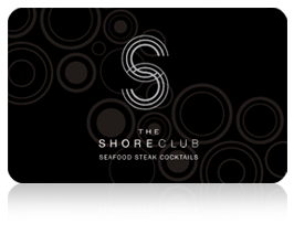
Located in Ottawa’s highest rated hotel The Westin Shore Club is a oceanic wonder. The Shore Club was newly remodeled and features a daily fresh sheet which outlines “the finest seafood available” according to their site. You can also reserve the private dining room for business meetings as well as social gatherings.


I personally recommend each of these five places to any patron wanting to enjoy fine dining in Ottawa. Each of these places have a dress code and an esthetically pleasing ambiance to go along side it. Although Ottawa is small we have some hidden culinary Gems that will give your taste buds a run for its’ money.

Corners on Main

The Corners on Main is a new condo development in the heart of old Ottawa East, located at 166 Main Street. The development of the project has been contracted to Domicile Developments. Roderick Lahey and John Doran are the lead architects of the buildings. The 3.5 acre site was purchased by Doran from the Sisters of the Sacred Heart of Jesus in 2014 with the promise of preserving their convent. The two six story buildings consists of 140 customizable units and retail space on the ground floor. Sales of the condos have already begun with prices ranging from $150,500 to 594,500.

ssj_13

The Sisters of the Sacred Heart of Jesus were sent to Ottawa in 1902 from France to provide scholastic and domestic services to the oblate Fathers. By 1910 the Sisters had established their own convent on Oblate Avenue. The convent is well known for their vegetable garden on the northwest portion of the property near Main St. The convent will remain beside The Corners on Main for the remaining sisters to live out the rest of their days.

0808-home-corners-caption-site-plan-for-the-corners-a-condFloor Plans for the Corners on Main Buildings

The buildings are conveniently located on Main Street between Oblate Avenue and Springhurst Avenue, just minutes away from the Rideau River and the Rideau Canal. There is a private park between the two pet friendly buildings where residents can bring their animals to enjoy a smoke free environment. The building amenities include a fitness facility, guest suits, and a rooftop terrace.

terraceThe Roof Top Terrace will be available to All Residents

Corners on Main will breathe new life into Main Street with the modernization of the building. Not only will it bring more residents to the street, it will also bring new retailers to the area sprucing up the economy. Sales for the units launched in early July. These upscale units vary in price starting at 150,500 for a 291 square foot pied-a-terre unit to 594,500 for a 1431 square foot two bedroom unit with a terrace. Each unit comes with a four year extended warranty and is backed by Enbridge savings by design. Parking spaces are available to buy for units other than the pied-a-terre units for $33,000.There will be parking available to rent for $33 a month. The development is scheduled for completion in 2017.


Paul Nicholls Music Critique

https://soundcloud.com/paulnichollsofficial/drive

I am a lover of music and most of the trance/ techno music I have heard in the past has yet to please my ears as much as this Paul Nicholls Piece. When listening to this piece my mind wandered and it put me in a place of serenity. I imagined hearing this song in a lounge of some sort surrounded by friends, family, and good food. While I wouldn’t play this song in my car I would definitely listen to this song while sipping on vintage wine in my living room.

The Apple Iphone 5 Critique

The apple IPhone 5

topic_iphone_5

The apple Iphone5 is a handy tool some of its main features include:

  • Active noise cancellation with dedicated mic
  • Airdrop file sharing
  • Siri natural language commands and dictation
  • iCloud cloud service
  • TV-out
  • Maps
  • Audio/video player/editor
  • Organizer
  • Document viewer/editor
  • Photo viewer/editor
  • Voice memo/dial/command
  • Predictive text input

This being said there is also a great camera function on the phone, it includes a front and rear facing camera for FaceTime capabilities. There is a flash function that also works as a flashlight that can be easily found in the pull up bar on the main screen.  The camera features a 1/3.2” sensor size, 1.4 µm pixel size, simultaneous HD video and image recording, touch focus, geo-tagging, face detection, panorama, and HDR photo.

I use my Iphone5 on a daily basis for all of my technological needs. Some of the uses I need my IPhone for are:

  • I use it as a phone to make phone calls
  • I use it for text message and picture message capabilities
  • I use it for video chat
  • The Alarm to wake me up
  • The Calendar to keep track of important dates and appointments
  • I use it as an installation tool for installing Wi-Fi products such as wireless extenders and my Wi-Fi baby monitor
  • I use this device to play games and use various applications for entertainment

My IPhone is a necessity to me, when the phone dies it devastates me because my main source of informational technology is dead. I really like this phone because it is user friendly and it isn’t very big like other phones in its comparison. This phone is handy when installing different Wi-Fi devices because it automatically finds the device and enables the installation of the software through the LAN local settings. I wouldn’t trade my iPhone for another device I absolutely adore the usability of this product.

2004 Toyota Echo Hatchback Critique

2004 Toyota Echo Hatchback

Echo

My 2004 Toyota Echo hatchback vehicle isn’t much to look at when you first see it. Although, my husband thinks it looks like a baseball cap, this car has benefitted us in many ways. When the seats are folded down in the back this car is very useful, we have transported very large items including a snow blower in this vehicle.

The vehicle has a 1.5 L Inline 4-cylinder engine which is durable and easy to fix because all of the parts are at arm’s length. Engines that are 1.5 liters aren’t very fast, they have 108 horsepower at 6000 rpm. This car averages 60 km per gallon of gas, that being said a tank of gas for this car lasts us approximately two weeks. I have the five speed manual version of this car and it is very easy to drive, although it isn’t luxurious it is practical.

I use this car for winter driving mostly because the car isn’t very fancy and can take the cold harsh winters we have here in Ottawa. This car has a four star safety rating according to cars.com which enables me to feel safe driving my four month old daughter around in this vehicle. Toyota’s safety ratings for all of their cars went down in the recent years because of their airbag/ break issues in the corolla models.

The down side to my particular model of vehicle is that, it is a base model. Base model cars don’t have any luxuries. Therefore, some of the features that I cannot enjoy in this car that I can in my other car are:

  • Automatic windows, in the cold I have to manually wind down my window.
  • No leather interior.
  • No heated seats.
  • There is no sunroof
  • There is a stock base model cd player
  • No navigation
  • No auxiliary port to attach devices to the stereo

This car is very small and does not have any rear speakers which is an advantage and also a disadvantage at the same time. The advantage of this is that I can play music louder and it won’t affect my little girl’s ears. The disadvantage is that any adults in the back seat won’t be able to listen to music as loudly as they would like.

This is a very reliable, safe vehicle that is great on gas. With this economy a car like this is priceless. I enjoy driving this vehicle, it shifts very smoothly and is easy to manage in a parking lot. Next time you need to buy a winter vehicle, consider an echo it is a great investment.

Website Critique

Website critique

Background Information:

BabyCenter_Logo 

Http://www.babycenter.com/ is a great go to website, for tips and information for new and expectant parents. This website has valuable information for any parent of children varying in age, from in utero, to approximately age ten. Some of this information includes product recalls, nutritional information, advice and support, pregnancy facts week by week and many other useful tools.

A great feature of the website is the email newsletters. Once the user has signed up for weekly emails, the website takes their information and generates an email based on the child/fetus’s age. In the emails, users can find details on parenting tips for various stages and age ranges for infants. These tips includes information like, when to stop feeding certain foods and for the pregnant mothers it sends weekly updates of the fetus’s growth patterns.

Arrangement

This website is unsuccessful at achieving suitable, eye catching arrangement. At first glance this website looks extremely cluttered. There is a lot of information coming at the reader in all different forms of content. There are videos on the right side of the screen and two tool bars at the top of the screen which appears to be dynamic. This can be overwhelming, especially for a new mother, who is seeking out advice and tips on caring for a newborn. Every link on the page seems to be clustered at the top and as you scroll down, there appears to be white space nearing the “more tools” and “contact us” section.

Emphasis


When looking at this website you can tell that the designer is emphasizing the tools that help parents in calculating various things, the support blogs and the video of the week. These items have a fairly large heading in comparison to the font in the tool bars and they are grey in contrast to the white background. The video of the week is fairly large and is eye catching because the definition is different from the pictures on the rest of the screen.

Clarity


This website isn’t very clear. There is a lot of clutter on the screen and it is, seemingly hard to navigate. The designer attempts to create on screen clarity by, putting boxes around the content to frame it. This just groups the information in a non-definitive order. If the website had listed the content in alphabetical order it would have improved the clarity.


Conciseness


The website designer was very concise when it comes to: the grey scale in the headings on the page, the boxes around the featured text, bold in the font in the tools section and the green blue and white color scheme. The issue is that, the elaborate design in this website, slows down the usability and restricts users who would want to move quickly through the information.

Tone


The tone of this website is visually frenetic, there is a lot going on, on the page at once. The designer seems to be more interested in emphasizing the tools on the page, than the information. The underlying tone is professional. The authors of this website want to deliver the most professional, up-to-date medical information, available and you can see this in their wording.

Ethos


The “babycenter” website has the look and feel of a magazine. They are targeting women who predominantly read magazines by, adding tools and quizzes to give the website a trusting vibe. Women who grew up reading magazines as their primary source of information, will be drawn to this website just by its design layout. They will in turn, trust the content of the website as they have trusted the content of so many magazines over the years, therefore building ethos.

Gestalt Principles


The following table explains how the http://www.babycenter.com designers incorporate the Gestalt Principles in their design.


Principle How babycenter.com Incorporates the principle
Figure-Ground Contrast This principle is predominantly shown in the framing of the content on the website. The frame makes the content stick out from the background showing importance. The darker tone enhances the white field in the background
Degrading Figure-Ground with Visual Noise The visual noise in this website occurs towards the bottom of the page, where you see lists and advertisements. The web designers purposely put white space in-between the content of the page and the visual noise to enhance the contents in the framed boxes.
Grouping The grey boxes around the content, fences off one group from another on the page. Although there is a list of tools at the bottom of the page, the most significant titles are grouped and sectioned off by grey frames. The closure of the text creates cohesion.
Patterns: Creating Groups Across the Communication The layout of this website is a large pattern. The tools and advice topics are bolded in an aquamarine color. The important headings are portrayed in dark grey color. The advertisements are colored in green. Any type of “go”, “join now”, “go, calculate” or search buttons, is in a green color.

 Visual Language Matrix


Below is a model of the visual language matrix which incorporates the four levels of design and the three coding modes. This matrix is filled out in accordance to the applicable information visible on http://www.babycenter.com.

  Textual Spatial Graphic
Intra ·         Plain Type Style

·         12 point font

·         Normal spacing between characters ·         Punctuation marks
Inter ·         Hyperlinks ·         Two clearly visible margins on the left and right side of the page


·         Text boxes surrounding important text

·         Aquamarine colored hyperlinks

Extra ·         Captions for Visuals ·         In the center of the page the picture size for the three links are the same size ·         Pictures are detailed

·         Pictures are in color

·         Use of color for data displays

Supra ·         Navigational Bars

·         Section Headings

·         Initial letters signaling the start of an article and major text segments

·         Page is a scrollable length

·         Portrait landscape

·         Placement of the data and pictures are visually appealing

·         Use of color scheme in text

·         Grey Scales around articles, pictures and videos

·